Netflix — Patterns and Flows

As a tv show aficionado, my absolute favorite thing to do is watch and discover new shows. I love the experience of being transported to another world and fully immersing myself in the lives of the characters I watch. When a show is especially intriguing, it’s not unusual for me to binge an entire season in one sitting. One platform that has contributed to my love for TV shows is Netflix. Netflix is a subscription based streaming service that allows members to watch TV shows and movie without commercials on an internet-connected device.
In this article I will explore how Netflix uses different design patterns to help its users discover and watch shows and movies and explain a common user flow for using the platform.
User Flow

Typically when a person goes on Netflix, he or she may know exactly what they want to watch beforehand or will spend some time searching for a show/movie to watch. Netflix makes it incredibly easy to do either. For someone who knows exactly what they want to watch, they can go about it in a few ways: going to their “Continue Watching” list on the home page, using the search bar to type out the tv show/movie title they had in mind, or going to their personal “Watchlist”.
On the other hand, for individuals who have just finished a show or movie and are on the hunt for something new to watch, Netflix has multiple ways methods to aid the discovery process. On the home page, there are curated lists based a the user’s watch history. There are even separate pages dedicated solely to tv shows, movies, and what’s new and popular. When you visit these pages, you can further filter the results alphabetically, by genres, even Netflix’s suggestions for you.
To illustrate the aforementioned, I’ve included a common user flow for Netflix users. It encompasses the steps taken for when a user knows what to watch and when they don’t know what to watch.
Design Patterns
Since it’s in Netflix’s best interest to have their users spend a lot of time on their platform, the interface must be conducive to that. Netflix is known for making it easy for users to watch and discover new tv shows and film. The design patterns they use are intentional to help serve that purpose.
Navigation

Navigation is a huge part of the digital experience. Good navigation allows users to stay on your site for longer and gives them the confidence and joy in using your site. With this in mind, Netflix keeps their navigation bar simple and clean in order to aid users in their search for things to watch. By including common categories in the navigation bar, users spend less time wondering the how to find things, and more time picking up their own ways of discovering things.
This simplistic navigation is carried over to each separate page as well. For example, when a user clicks on the “TV Shows” tab, they are directed to a separate page the mirror the home page in terms of appearance and navigation. This solidifies their knowledge and expectations on how to use the site.
Carousel

In addition to their clean and simple navigation, Netflix utilizes the carousel design pattern to display a limited amount of information at time. In their case, they display 6 items at a time for each carousel. This serves two purposes. One, it prevents users from feeling overwhelmed by the sheer number of shows and films on this platform, and two, it encourages explorations. Since a user cannot view everything all at once, they are encourage to click through the lists and see what else is out there, thus building intrigue and curiosity in what they will find next.
Cards

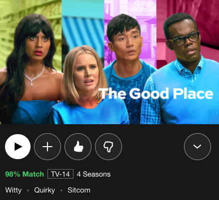
Lastly, Netflix utilizes cards as the dominant way to display information to the user. Since tv shows and films are a highly visual medium, Netflix has taken cues on how they want to present information to draw the user in. This is a useful design pattern because varying amounts of information can be displayed depending on how the user interacts with it. This keeps the interface uncluttered and easy to digest.
In Netflix’s case, if you’re simply scrolling, you’ll only be able to see a thumbnail of the show/movie. If you want to learn more, you can hover over the card or click on it. By hovering over the card, users can then play the video, add it to their “Watchlist”, and like or dislike the show/movie to inform Netflix on their personal interests. By clicking down button on the card, a full page will pop up containing information on the show’s synopsis, the number of seasons and episodes, and the cast and crew.


Final Thoughts
As a Netflix member for the past 6 years, I’ve noticed that it’s becoming increasingly intuitive and seamless. Each subsequent feature and piece of content they add continues to align with their original purpose of making it easy and enjoyable to watch and discover new films and tv shows!
